You place a button on screen and it looks fine. Then you run the game on a phone and it's cut off at the edge, or on a desktop monitor it sits alone in the middle. When you set UI positions by hand with position, every change in screen size breaks the layout.
Godot solves this with Control nodes and layout containers. You declare rules like "stack these vertically" or "center this," and Godot handles the placement for whatever screen size it ends up on. No more assigning coordinates one by one.
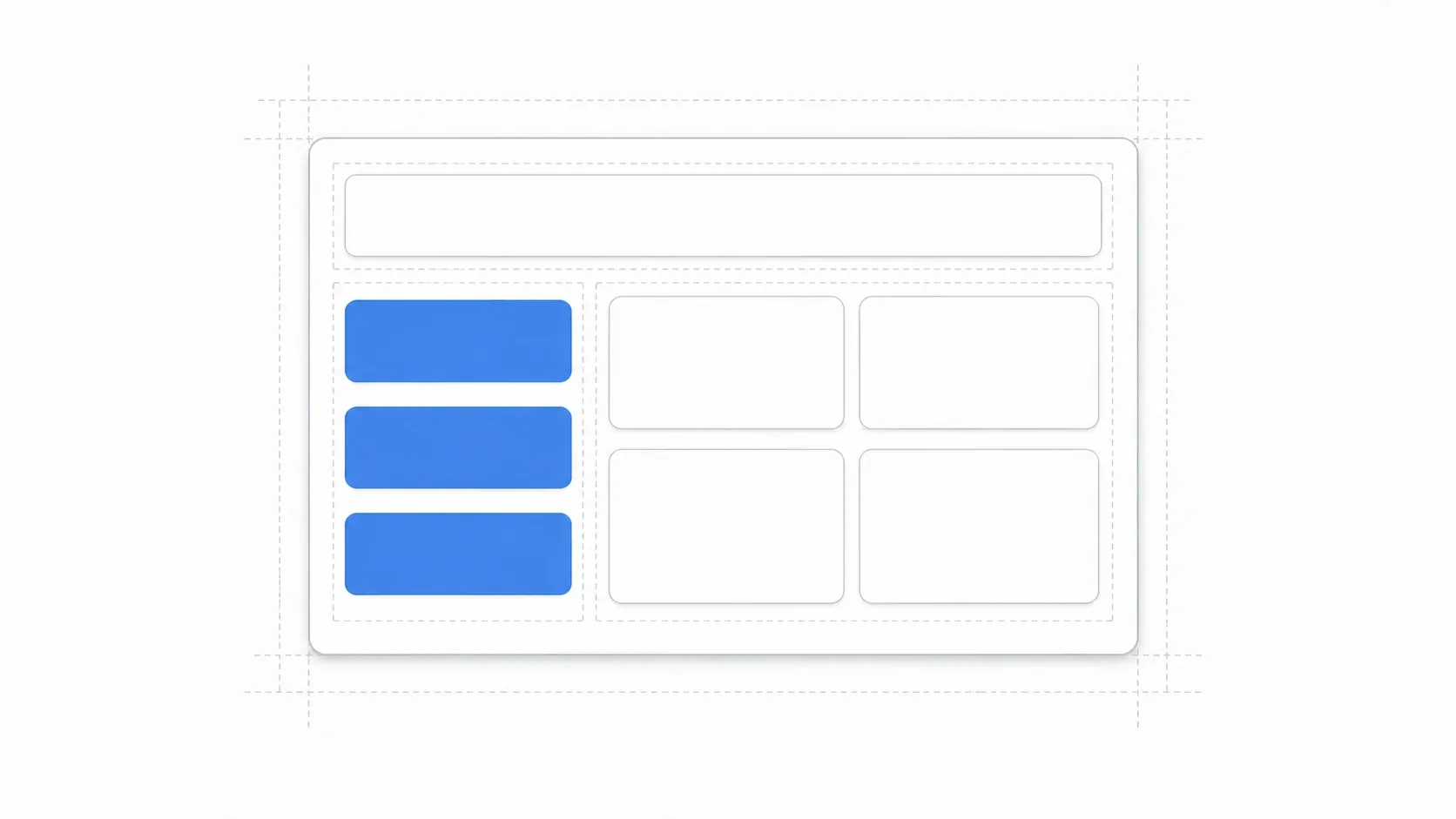
What You'll Learn
- How anchors on a
Controlnode make UI follow the screen size- When to use each major layout container:
VBox,HBox,Grid, and friends- How to nest containers to build complex UI like a settings screen
- How to control space distribution with Size Flags (Fill / Expand / Stretch Ratio)
Control Nodes and Anchors
The foundation of every UI element is the Control node. It draws to the screen just like Node2D types such as Sprite2D, but it comes with features specific to UI.
- Anchors and offsets: These decide which part of the parent an element is positioned relative to, and how far it is offset from there. This is the key to keeping a layout intact when the screen size changes.
- Input handling: Control nodes provide signals for UI-specific input such as button clicks and slider drags.
- Themes: They support a system for managing colors and fonts in one place (see Building Consistent UI with the Theme System).
Anchors matter most. Once you decide the reference points for the four edges, such as "top edge pinned to the parent's top, bottom edge pinned to the parent's bottom," the UI follows along whether the screen is large or small.
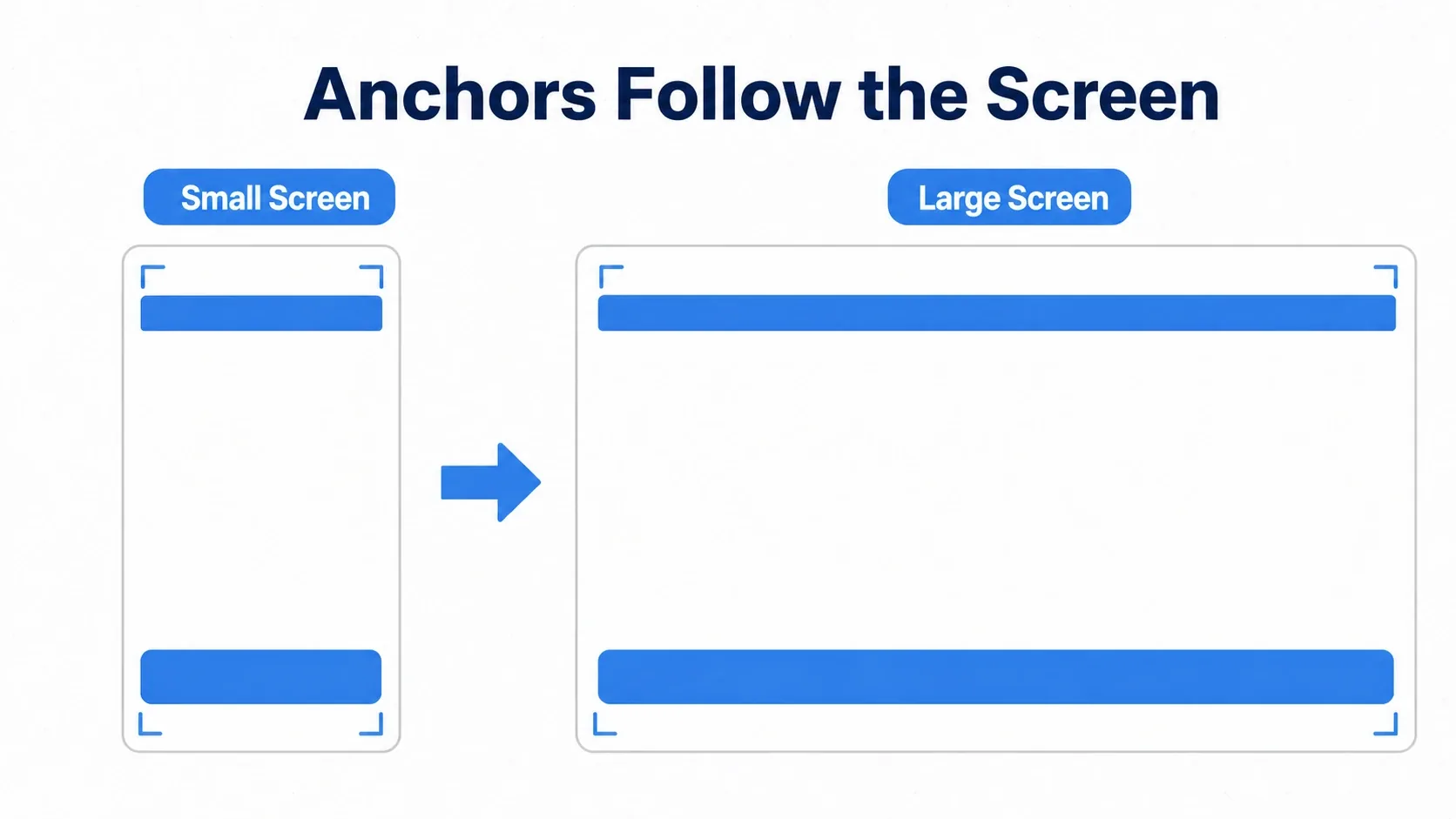
The Inspector's "Layout" menu has presets like Full Rect (fill the parent) and Center, so picking one from there is the quickest way to start.
Automatic Alignment with Layout Containers
You can place everything with anchors one element at a time, but for arrangements like "three buttons in a column," handing the job to a layout container is far easier than working out coordinates yourself.
A container is a special Control node that automatically arranges the size and position of its Control children. Instead of thinking in coordinates, you only think about how you want things arranged.
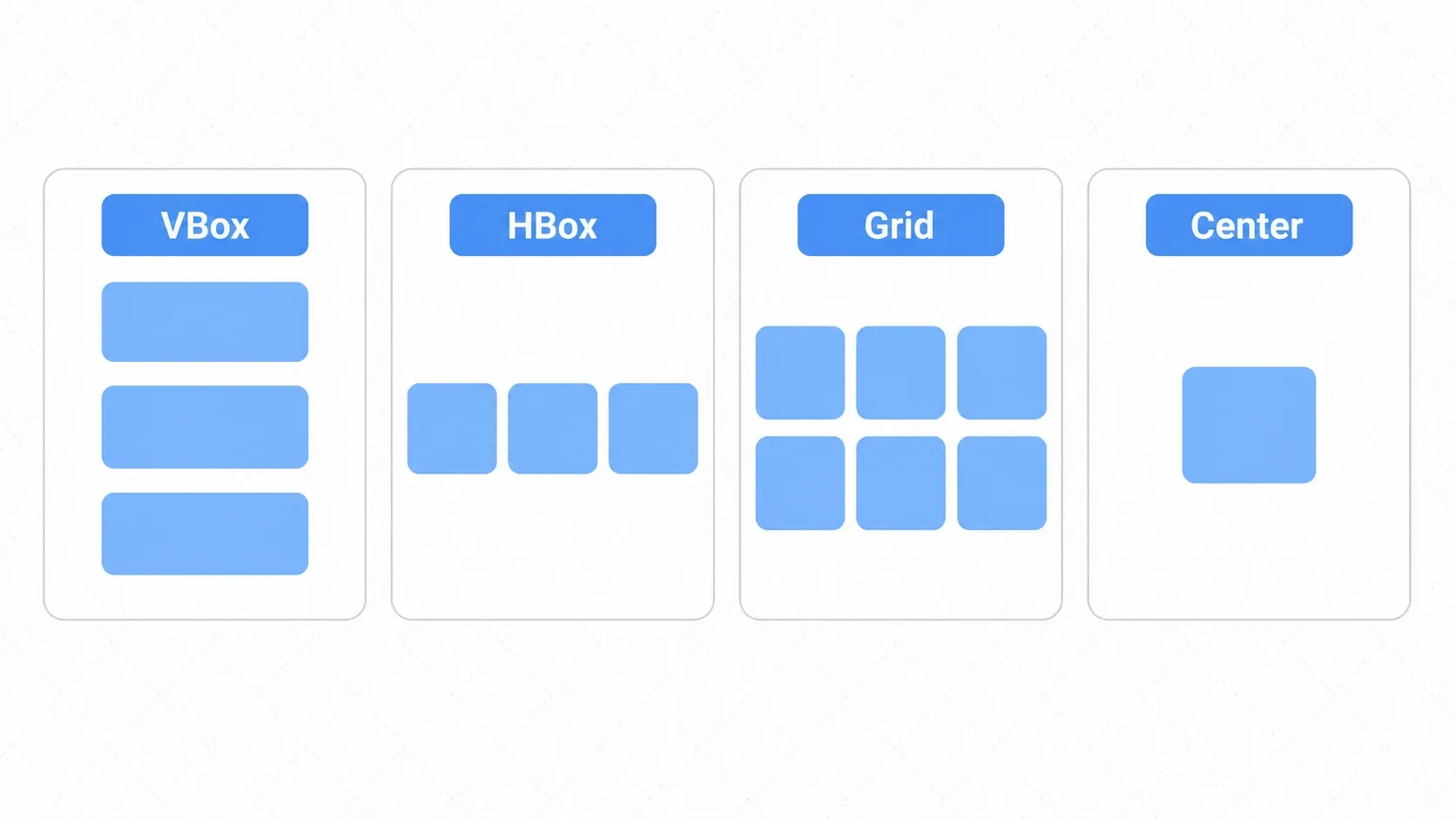
Here are the containers you'll use most often.
| Container | Arrangement | Common uses |
|---|---|---|
| VBoxContainer | Stacks children vertically | Main menus, lists of settings |
| HBoxContainer | Lines children up horizontally | Toolbars, OK/Cancel buttons |
| GridContainer | Arranges children in a grid | Inventories, skill trees |
| MarginContainer | Adds padding around its child | Safe margins along the screen edge |
| CenterContainer | Centers its child | Title logos, popups |
| PanelContainer | Draws a background panel behind its child | Window backgrounds |
| ScrollContainer | Adds scrollbars when content overflows | Long lists, variable item counts |
GridContainer, with its lattice arrangement, is exactly what you want for cell-based UI like the one in Designing an Inventory System.
Distributing Space with Size Flags
Size Flags decide how a container treats the size of its children.
- Fill: Expand to fill the space allocated to the element
- Expand: Claim a share of the container's leftover space
For example, if you set Expand on all three buttons in a vertical stack, the three of them split the height evenly. If you want just one of them to be twice as tall, set that button's Stretch Ratio to 2.
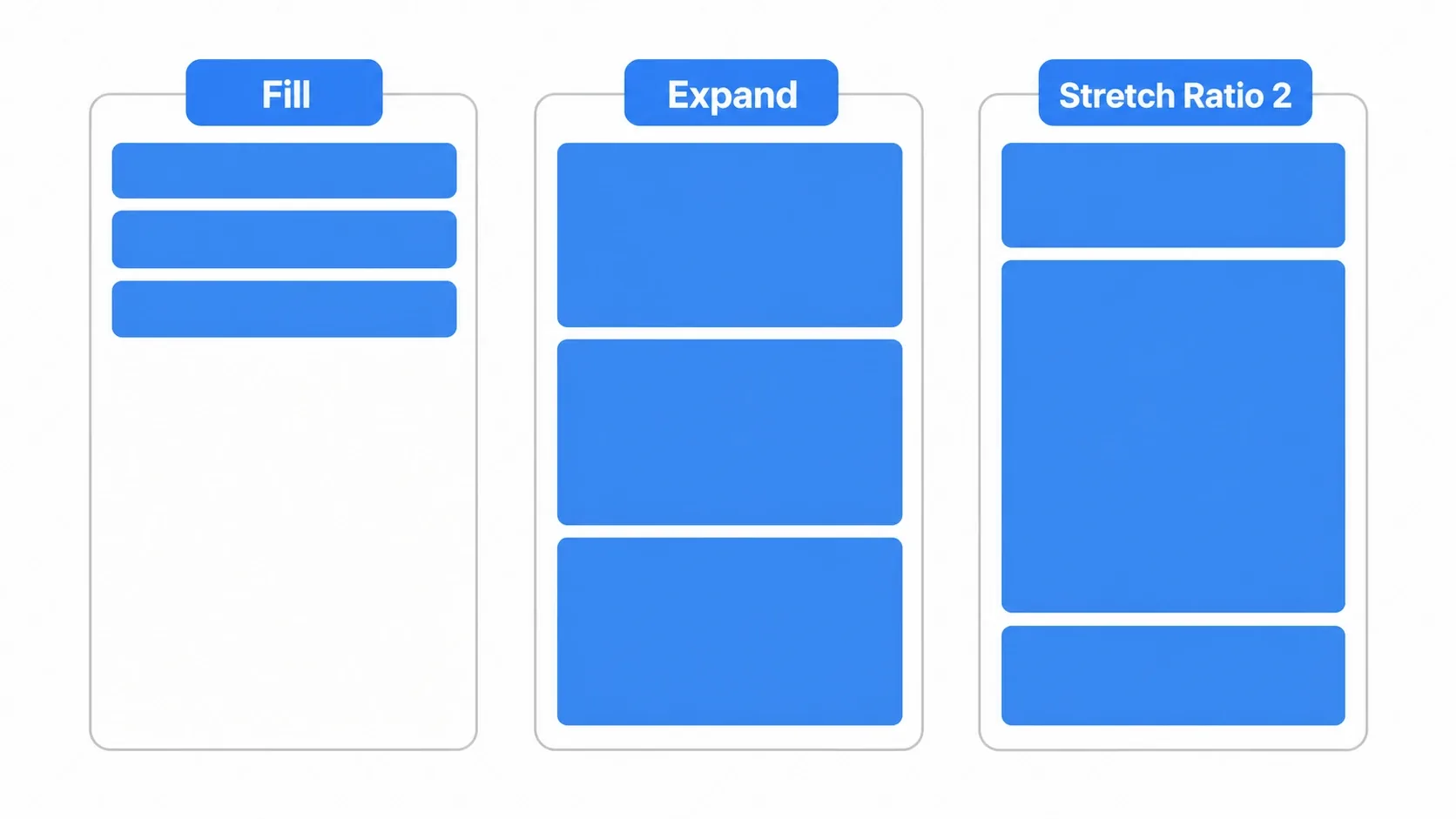
The strength of containers is that adjustments like "space these evenly" or "make just this one bigger" come down to properties instead of coordinate math.
Hands-On: Building a Settings Screen with Nested Containers
Real UI is built by nesting containers. RPG, FPS, or puzzle game, the skeleton of a settings screen is mostly the same: a margin around the edges, then settings stacked vertically, then a label and an input side by side in each row.
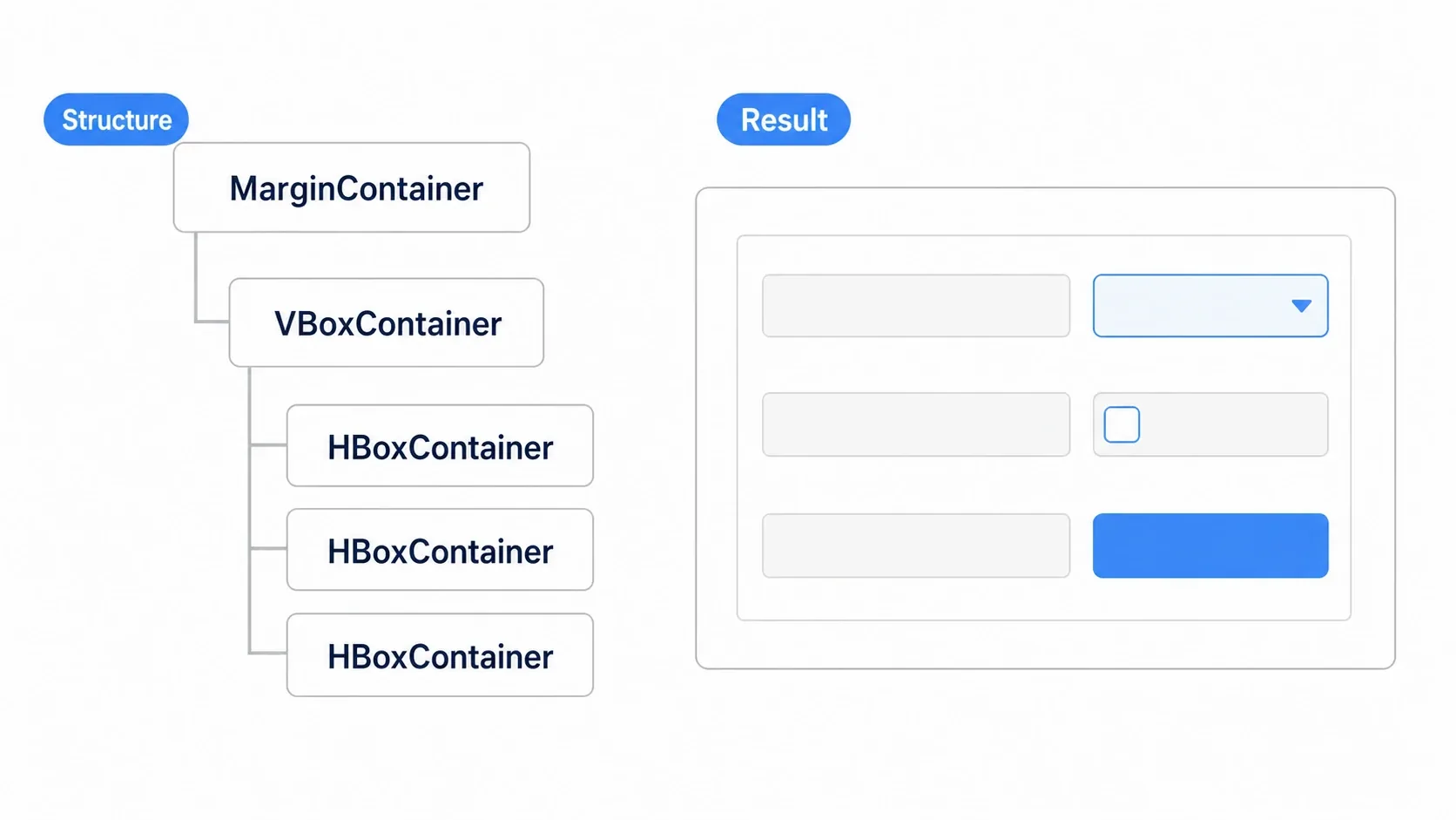
Layering containers by role gives you this:
MarginContainer          … keeps a margin around the screen edge
└─ VBoxContainer         … stacks the settings rows vertically
   ├─ Label              … heading, "Graphics Settings"
   ├─ HBoxContainer      … "Resolution" + dropdown, side by side
   │  ├─ Label
   │  └─ OptionButton
   ├─ HBoxContainer      … "Fullscreen" + checkbox
   │  ├─ Label
   │  └─ CheckBox
   └─ HBoxContainer      … the "Apply" button, right-aligned
      ├─ Control          … empty spacer that pushes things over (H:Expand)
      └─ Button
To right-align a button, the standard trick is to put one empty Control inside the HBoxContainer and set its Horizontal Size Flags to Expand. That spacer soaks up all the leftover room and pushes the button to the right.
On the code side, you just connect signals as usual. For the general approach to wiring UI parts together loosely, see Node Communication with Signals.
extends Control

# Referencing via a scene-unique node (%) survives path changes
@onready var apply_button: Button = %ApplyButton

func _ready() -> void:
    apply_button.pressed.connect(_on_apply_pressed)

func _on_apply_pressed() -> void:
    print("Settings applied")
Save this panel as a .tscn and you can reuse the exact same settings screen on the title screen and in the pause menu.
Common Mistakes and Best Practices
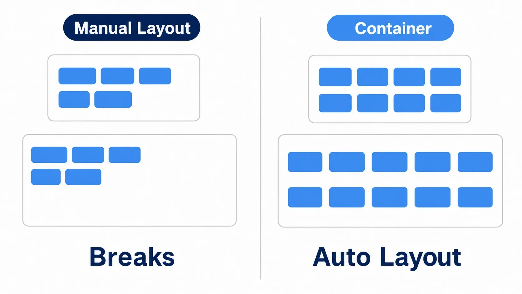
The most common mistake is skipping containers and setting position by hand. It looks fine on the screen you built it on, and falls apart at a different resolution.
| Common mistake | Best practice |
|---|---|
Placing everything manually by editing position | Let containers do the work and keep manual tweaks to a minimum |
| Writing code that adjusts positions per screen size | Use anchors and Size Flags and let Godot's responsive features handle it |
| Setting colors and fonts individually on every node | Manage the look in one place with a Theme resource (the theme article) |
| Cramming the entire UI into one giant scene | Turn reusable parts like health bars and buttons into separate scenes |
Leaning on get_node("long/path") everywhere | Make references robust with @onready and scene-unique nodes % |
Bonus: Good to Know for Later
- Custom drawing with
_draw(): For graphs or custom-shaped gauges that containers can't build, you can draw lines and circles directly in aControl's_draw(). - Don't nest too deep: Containers are convenient, but hundreds of children or excessively deep nesting adds cost to resize recalculation. Break things up into meaningful groups.
- Use
ScrollContainerfor long lists: Instead of creating hundreds of items at once, generating only the visible range keeps things light. - Use a Theme for a consistent look: Managing colors, fonts, and spacing together gives the whole UI a unified feel (see Building Consistent UI with the Theme System).
Summary
- Control nodes: The foundation of UI. Anchors make them follow the screen size
- Layout containers: VBox, HBox, Grid and others arrange children automatically, freeing you from coordinates
- Nesting: Layer them like Margin > VBox > HBox to build complex UI such as a settings screen
- Size Flags: Fill / Expand / Stretch Ratio control how space is distributed
Start by lining up three buttons in a VBoxContainer, then layer on a MarginContainer and HBoxContainer to grow it into a settings screen. From here, a good next step is Building Consistent UI with the Theme System, which shows how to style all of that UI at once.