You want to tweak a button color slightly, and suddenly you're editing dozens of buttons scattered across every scene one at a time. That is what happens when UI styling lives on individual nodes. Worse, the look drifts slightly from scene to scene, and the whole game starts to feel amateurish.
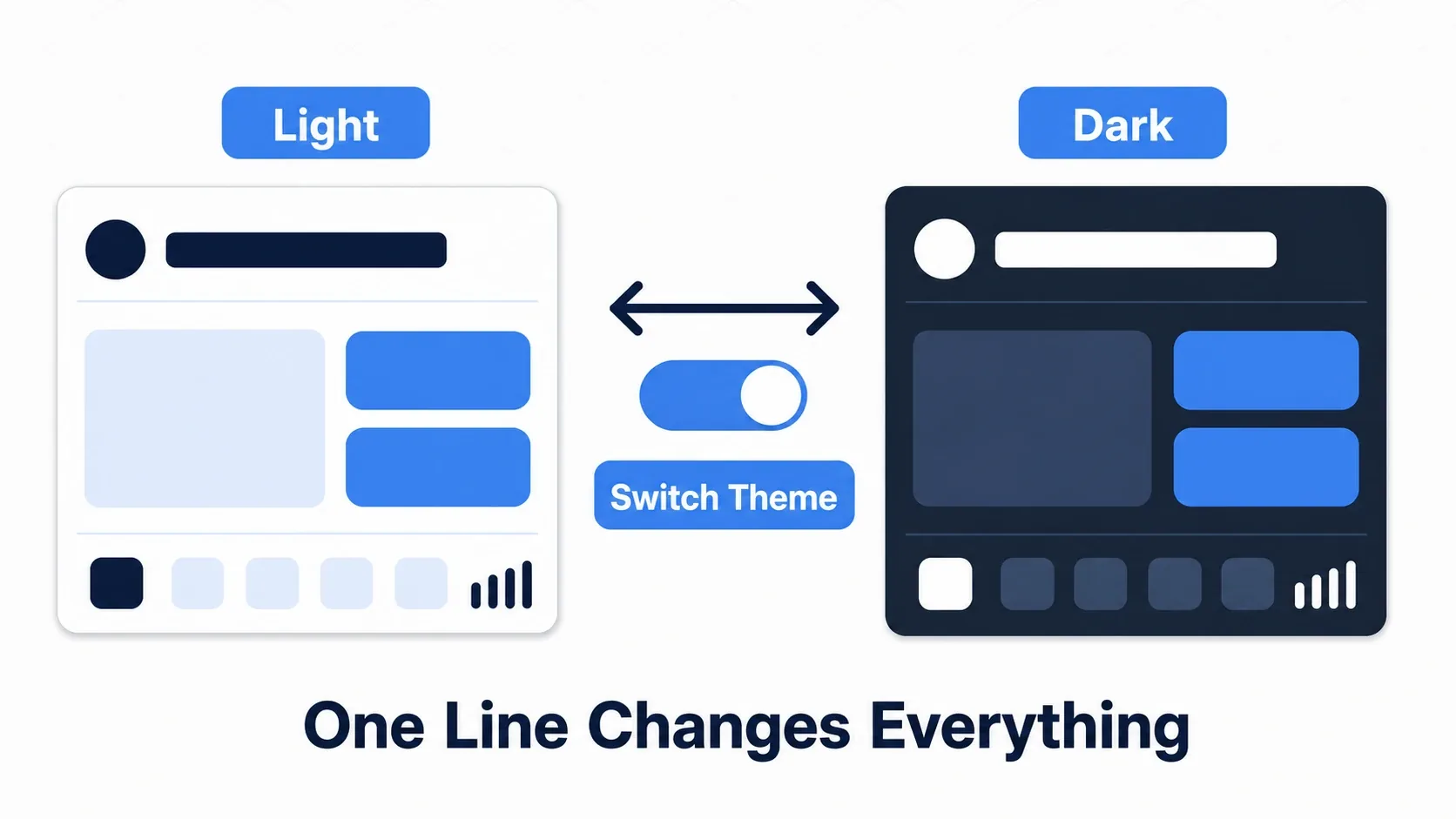
Godot's Theme system solves this. Colors, fonts, spacing, and button styles are managed together as a single design system, and swapping the theme changes the look of the entire UI at once. Features like a dark mode toggle suddenly become realistic to build.
What You'll Learn
- The five items that make up a
Theme(Color / Constant / Font / Icon / StyleBox)- How theme inheritance flows down the tree, and the priority order
- How to build normal / hover / pressed button states with
StyleBoxFlat- How to implement a dark mode toggle by swapping
preloaded themes
The Five Items That Make Up a Theme
Every UI node in Godot derives from Control, and a Theme resource decides how it looks. A Theme is a collection of items that define style.
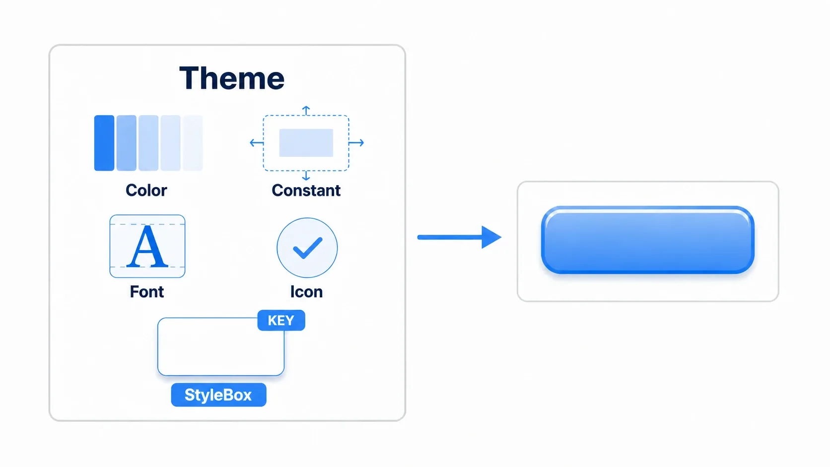
| Item | What it controls | Example |
|---|---|---|
| Color | Colors (text color, background color, and so on) | Button text color, label color |
| Constant | Numbers (padding, spacing, and so on) | Space between controls |
| Font | Fonts (family and size) | Body font, heading font |
| Icon | Icon images | The checkmark on a checkbox |
| StyleBox | The most important one. Background, border, corner radius, shadow | The look of buttons and panels themselves |
Each item is keyed by a combination of "which node type (for example Button)" and "which item name (for example font_color or normal)." Of these, StyleBox is the heart of the system and carries most of your design.
Theme Inheritance and Priority
Themes cascade down the scene tree much like CSS. When the same element is specified in more than one place, priority goes in this order:
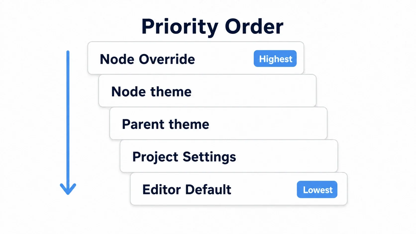
- Node-specific overrides (
add_theme_*_override()) ← highest priority - That node's own
theme - A
themeinherited from a parent - The default theme in Project Settings
- The Godot editor default (final fallback)
The ideal flow is to unify the whole project under one global theme and override only the exceptions further down. That gives you a clean split: 90% theme, 10% individual tweaks.
Designing Buttons with StyleBoxFlat
Let's start with no code at all and play with the theme editor. In the FileSystem dock, right-click, choose "New Resource," pick Theme, and save it as main_theme.tres. Assign it under Project Settings → Gui → Theme → Custom and it becomes the default theme for the entire project.
The item you'll use most in the theme editor is StyleBoxFlat. One of these gives you background color, corner radius, border, and shadow, so it covers everything from flat design to a Material-style look.
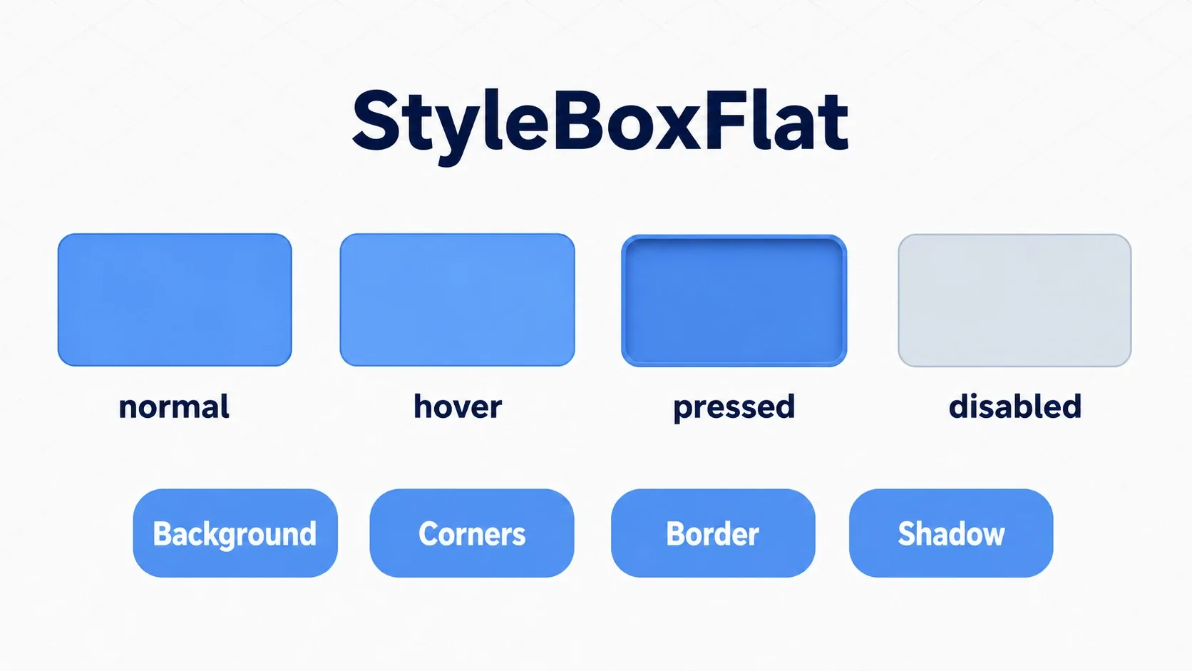
Add the Button type, create a "New StyleBoxFlat" for normal under Styles, and set the following:
- Bg Color: The background color
- Corner Radius: Rounding on the four corners
- Border Width / Color: Border thickness and color
- Shadow: A shadow for a sense of depth
Do the same for hover (slightly brighter), pressed (slightly darker), and disabled (faded) to make state changes feel natural. With that, every Button in the project automatically matches this style.
Hands-On: Building a Dark Mode Toggle
The real value of themes is that you can swap them wholesale from code. Let's build the dark mode / light mode toggle that shows up in so many games and settings screens. Whether it's an RPG or a utility app, the work is the same.
Prepare two files, light_theme.tres and dark_theme.tres, and put the switching logic in an Autoload singleton.
# settings.gd (registered as an Autoload)
extends Node

const LIGHT_THEME := preload("res://themes/light_theme.tres")
const DARK_THEME := preload("res://themes/dark_theme.tres")

var is_dark := false:
    set(value):
        is_dark = value
        _apply_theme()

func _ready() -> void:
    _apply_theme()

func _apply_theme() -> void:
    # Setting the theme on the root (viewport) makes it cascade to the whole UI
    get_tree().root.theme = DARK_THEME if is_dark else LIGHT_THEME

func toggle() -> void:
    is_dark = not is_dark
Call Settings.toggle() from a button in the settings screen and the entire game's UI switches instantly. Connecting the button to that call is a job for signals.
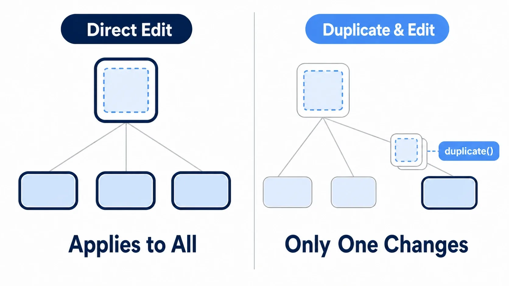
When you want to highlight one specific button temporarily, leave the theme alone and override just that node. But never modify a shared resource directly, always .duplicate() first.
func highlight(button: Button) -> void:
    # Editing the shared StyleBox would affect every button -> duplicate, then edit
    var box := button.get_theme_stylebox("normal").duplicate() as StyleBoxFlat
    box.border_width_bottom = 8
    button.add_theme_stylebox_override("normal", box)
    button.add_theme_font_size_override("font_size", 24)
There are two points to take away.
- Change everything at once by swapping the theme: Replace
get_tree().root.themeand the whole UI updates together. You never touch nodes one by one. - Override only exceptions, and always duplicate: The value returned by
get_theme_stylebox()is shared. Editing it in place hits every button, so overriding with a.duplicate()d copy is the rule.
Common Mistakes and Best Practices
| Common mistake | Best practice |
|---|---|
Overriding everything individually with add_theme_*_override() and ignoring inheritance | Define a base theme and override only the differences further down |
| Cramming every style into one enormous theme | Split by concern, such as "base," "game UI," and "menus" |
Modifying the return value of get_theme_stylebox() in place | Always .duplicate() before modifying, to avoid side effects on shared resources |
| Skipping themes and configuring every node individually | Define 90% of your UI in the theme and override only the exceptions |
Bonus: Good to Know for Later
- Make custom Controls theme-aware: In your own UI nodes, handle
NOTIFICATION_THEME_CHANGEDin_notification(), re-fetch values withget_theme_color()and friends, then callqueue_redraw()so the appearance follows theme changes. - Split themes and combine them: Layering a menu theme and an in-game HUD theme on top of a base theme keeps things manageable.
- Preload the themes you swap: Themes you switch between, like dark and light, are best
preloaded so switching is just an assignment. - Layout comes first: Before worrying about looks, get placement right with Control Nodes and Layout Containers. A theme has much more impact on a well-structured layout.
Summary
Theme: Manages your UI's look in one place through five items: Color / Constant / Font / Icon / StyleBox- Inheritance: Override > node's theme > parent > project > editor. Unify globally, override exceptions
StyleBoxFlat: Designs buttons and panels via background, corner radius, border, and shadow. Provide one per state (normal / hover / pressed)- Runtime switching: Assign a
preloaded theme toget_tree().root.themeand dark mode is done. Always.duplicate()before an individual override
Start by creating a single StyleBoxFlat in the theme editor and changing how Button looks. That alone makes your UI feel far more coherent. Pair it with Control Nodes and Layout Containers for the layout side and you've got the fundamentals of UI work covered.