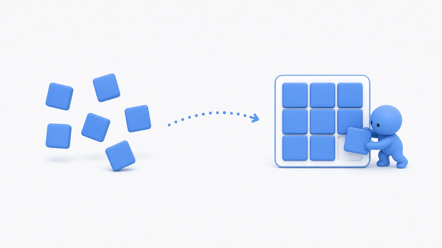
You lined up 20 inventory slots by hand, fiddling with coordinates one at a time. The next day someone says "change it from 5 to 6 per row" — and you re-lay-out all 20. When you align UI by hand, this chore comes back every time the spec changes.
Let Unity handle the arranging. A Layout Group is a component that, just by attaching it to a parent, automatically aligns the child UI. Whether items increase or decrease, or the row count changes, the layout always tidies itself up. For the Canvas and anchor foundations, start with Canvas Basics.
What You'll Learn
- When to use each of the three Layout Groups — Horizontal, Vertical, Grid
- Making layout dimensions with Padding and Spacing
- Content Size Fitter — a panel that "stretches to fit its contents"
- Making individual exceptions with Layout Element
- The common pitfall — the truth behind "I can't move a child by hand"
- Hands-on: building an inventory with ScrollView + Grid
Tested with: Unity 6 (6000.x)
- The Three Layout Groups and When to Use Them
- Making Dimensions — Padding, Spacing, Child Alignment
- Content Size Fitter — a Panel That Grows with Its Contents
- Layout Element — Making Individual Exceptions
- Common Pitfalls and How to Fix Them
- Hands-On: Building an Inventory with ScrollView + Grid
- Bonus: Good Things to Know in Advance
- Summary
The Three Layout Groups and When to Use Them
There are three Layout Groups. You just pick by which direction you want to arrange things.
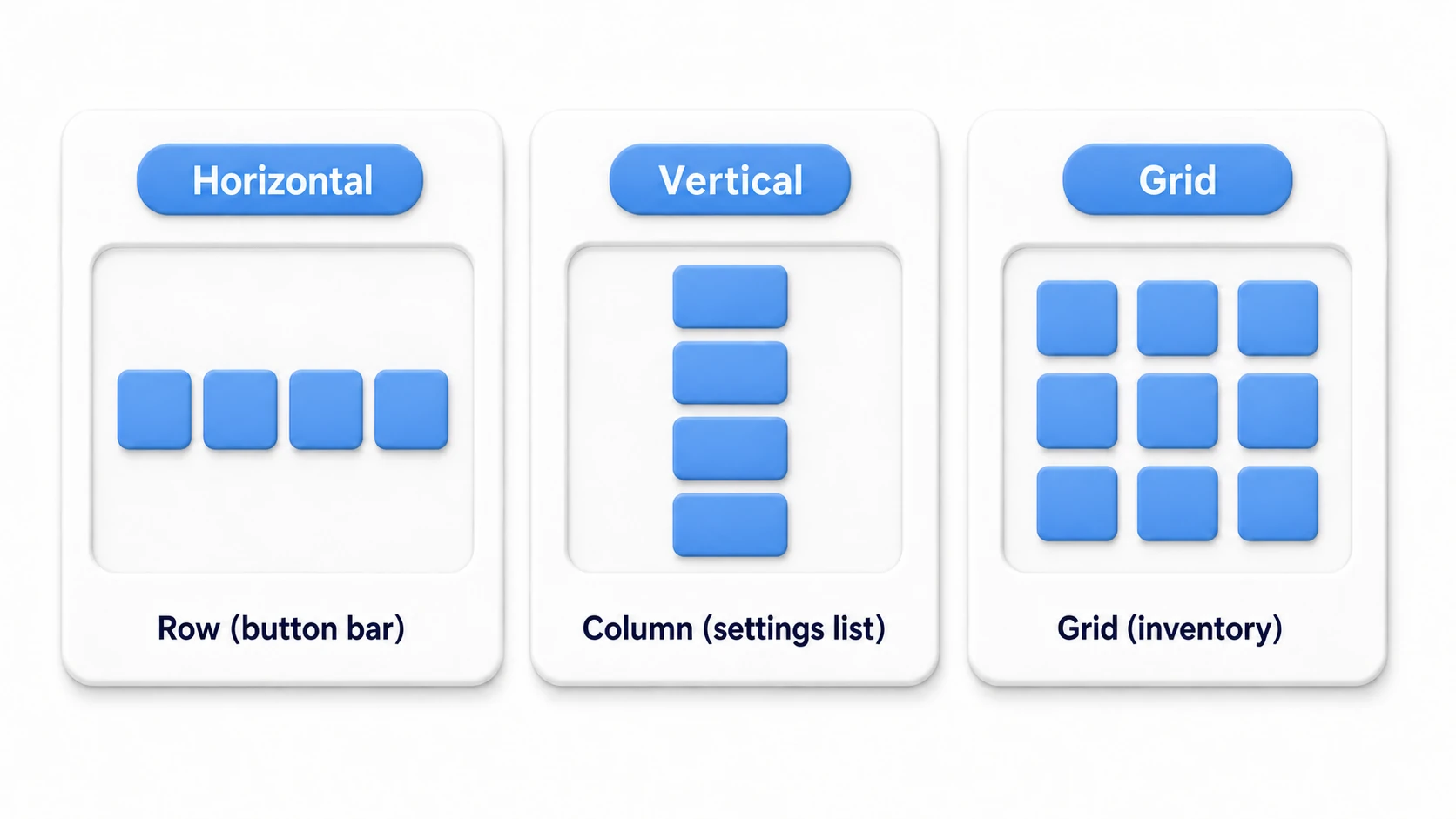
| Component | Arrangement | Typical use |
|---|---|---|
| Horizontal Layout Group | A single row | Bottom-screen button bar, tabs, heart-based HP display |
| Vertical Layout Group | A single column | Settings list, chat log, result rows |
| Grid Layout Group | A grid | Inventory, stage select, gacha results |
Usage is the same for all: attach it to a parent object and hang children off it.
- Create an empty UI object (e.g.
ItemContainer) and add aVertical Layout Group. - Place buttons or panels as its children — the moment you do, they align on their own.
- Add, remove, or reorder children (drag in the Hierarchy), and the layout always follows.
tips Right after you add Horizontal or Vertical,
Child Force Expandis on and hands the leftover space to the children (Control Child Sizeis off, so the children keep their size and just spread apart). Start by unchecking Child Force Expand to "just arrange," and the behavior becomes easier to predict. When you want the Layout Group to decide the children's size too, turnControl Child Sizeon.
Making Dimensions — Padding, Spacing, Child Alignment
After alignment, the "margins" and "how tightly things pack" are decided by three properties.
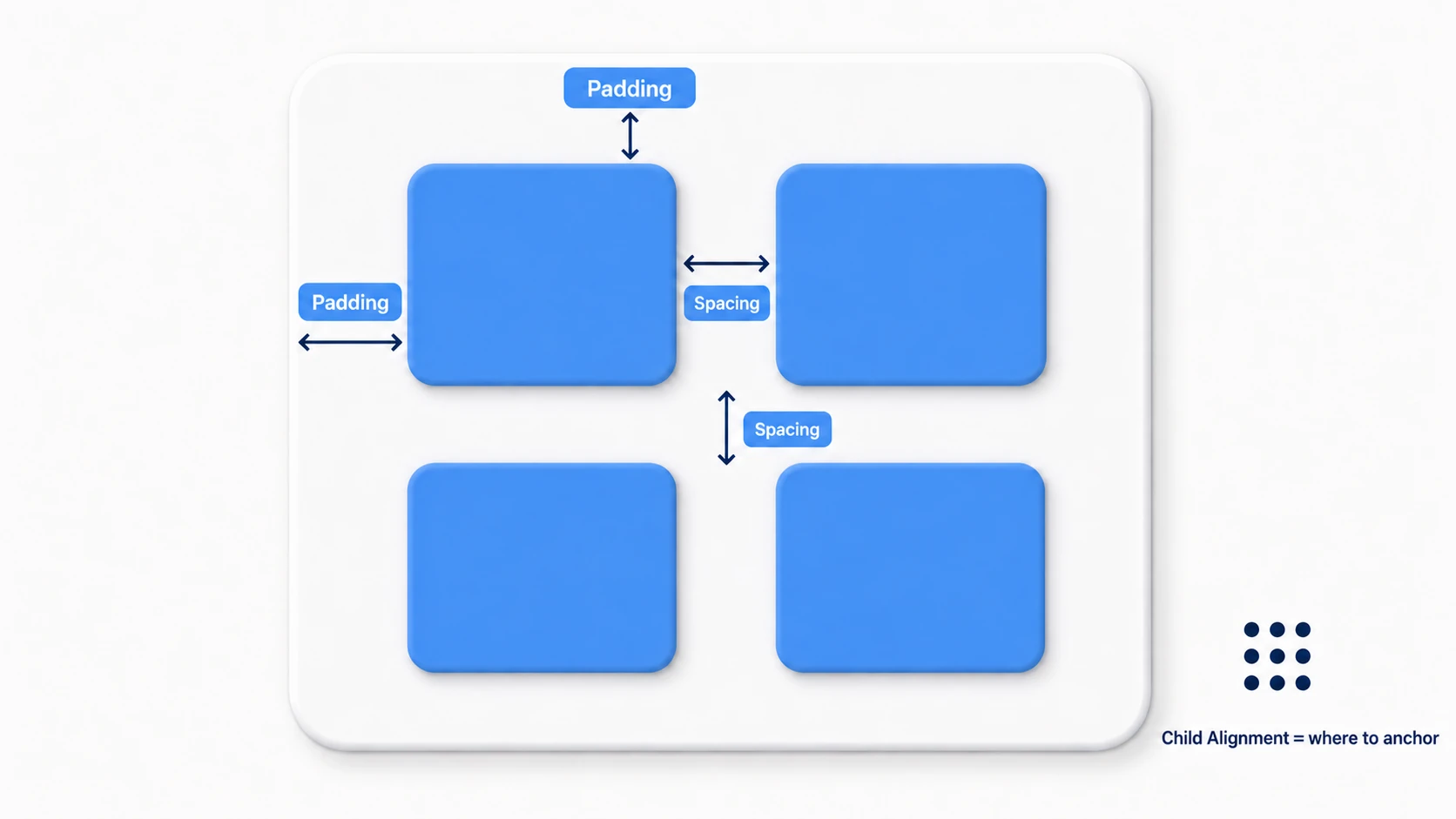
- Padding: The margin between the group's outer edge and the children (set individually for left/right/top/bottom). Think of it as the inner margin of a picture frame.
- Spacing: The gap between children. For Grid you can set it separately for horizontal and vertical.
- Child Alignment: Where in the group the children are anchored (top-left, center, bottom-right, etc. — 9 choices).
Grid also has Cell Size (the cell size shared by all slots) and Constraint (a fixed column or row count). If you want "6 columns per row fixed," set Fixed Column Count = 6 — and the opening "change from 5 to 6" becomes changing just this one number.
Content Size Fitter — a Panel That Grows with Its Contents
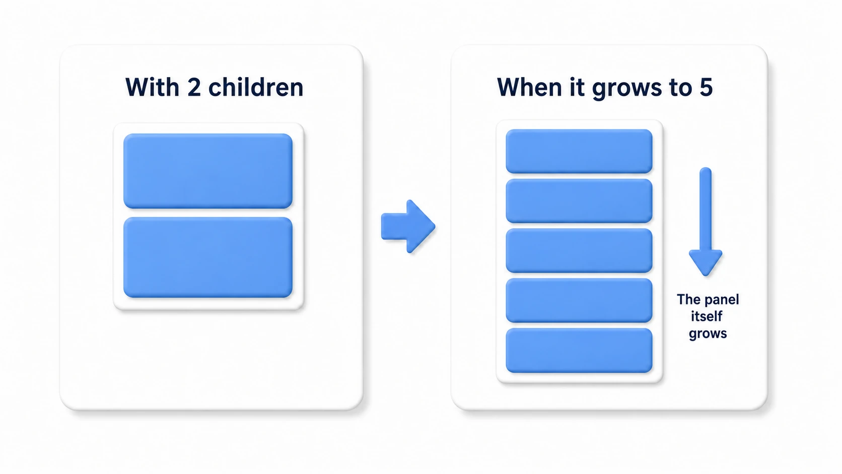
A Layout Group arranges children, but it doesn't change the size of the parent panel itself. For a "grows with its contents" panel — "stretch the dialogue window to fit the number of lines," "make the chat log grow as it fills up" — combine it with a Content Size Fitter.
- Add a
Content Size Fitterto the same object that has the Layout Group. - Set the Fit for the direction you want to grow to Preferred Size (
Vertical Fitif growing vertically).
Now the panel itself expands and contracts to exactly fit "the total size of children + Padding." This combination is also the star of the next hands-on section (ScrollView).
Layout Element — Making Individual Exceptions
"Make just this item in the list twice as tall," "keep this divider out of the alignment" — individual exceptions are specified by attaching a Layout Element to the child.
| Property | Meaning |
|---|---|
| Min Width / Height | The minimum size it won't shrink below |
| Preferred Width / Height | The size you basically want it to be (used most often) |
| Flexible Width / Height | How much leftover space it absorbs (a ratio) |
| Ignore Layout | Completely exclude it from the alignment |
The priority is "aim for Preferred, shrink to Min when tight, and let Flexible soak up any surplus." To start, remembering just Preferred for per-item sizing and Ignore Layout for exclusion is enough. The size values only take effect on axes where the parent's Control Child Size is on. In a Grid, Cell Size wins, so only Ignore Layout takes effect.
Common Pitfalls and How to Fix Them
You can't move a child's RectTransform by hand
Select a Layout Group's child and the RectTransform values are grayed out and immovable. It's not a bug — it's the display saying "these values are being managed by the Layout Group."
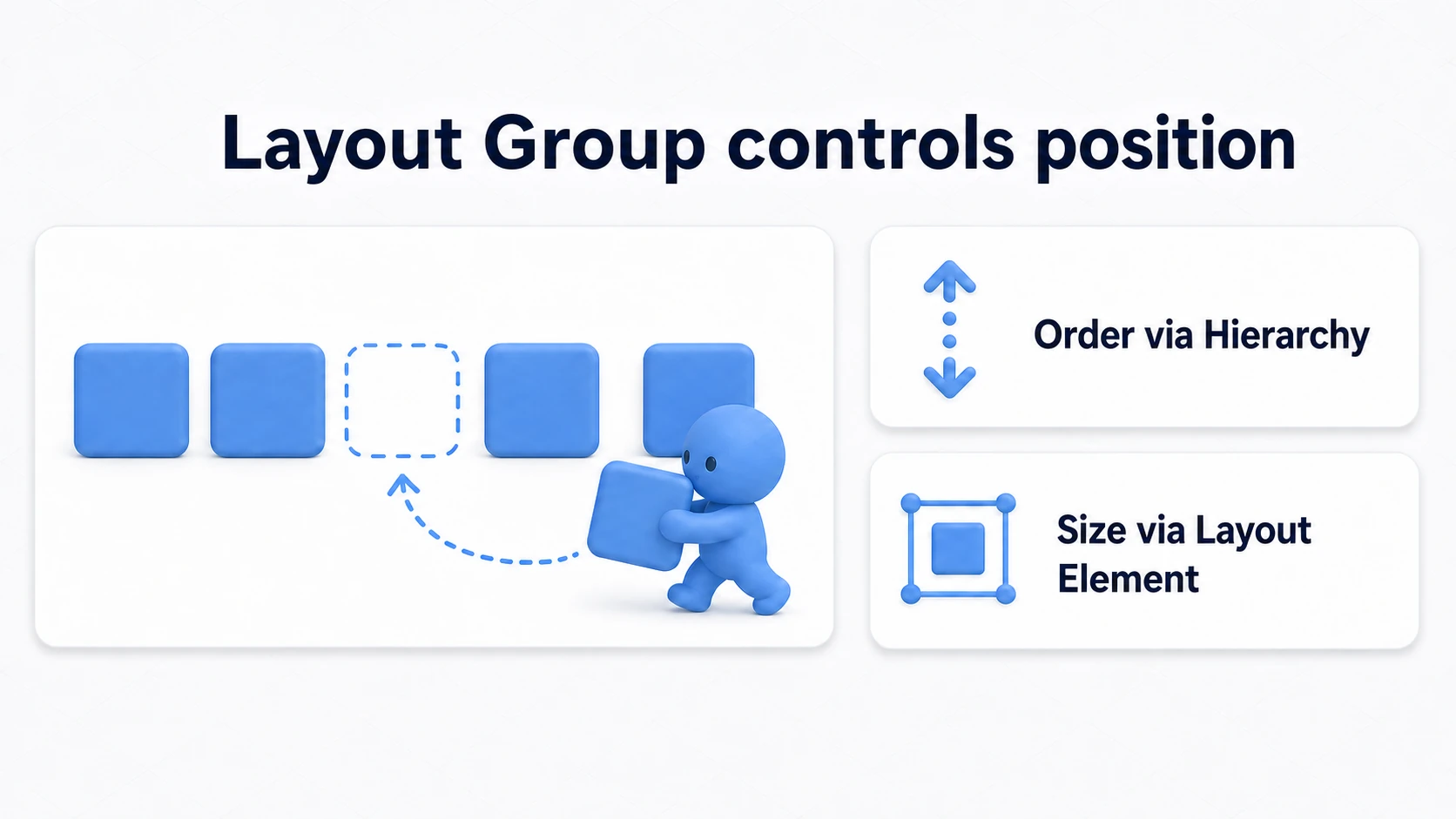
- Want to change position → change the order in the Hierarchy (alignment order = Hierarchy order)
- Want to change size → specify it via a Layout Element's Preferred
- Want just one to be free → turn on Ignore Layout
The trick is to switch your head from "move it by hand" to "tell the Layout Group."
The Content Size Fitter conflict warning
Attach a Content Size Fitter to a child of the parent Layout Group, and you get a conflict warning: "the parent controls the child's size, yet the child is also trying to decide its own." The basic rule is don't attach a Content Size Fitter to an object whose parent has a Layout Group (leave the size to the parent's Layout Group and give instructions from the child with a Layout Element). Attaching it to the same object as the Layout Group, as with the Content in the hands-on, is the right combination.
The layout is off for just the frame it's added
Layout recalculation happens in a batch just before that frame is drawn. If you grab the position right after adding a child from a script, you may get the pre-alignment coordinates. When you need the correct position immediately, force an instant recalculation with LayoutRebuilder.ForceRebuildLayoutImmediate(content); (pass the parent RectTransform that has the Layout Group, not the child you added; it needs using UnityEngine.UI;).
Hands-On: Building an Inventory with ScrollView + Grid
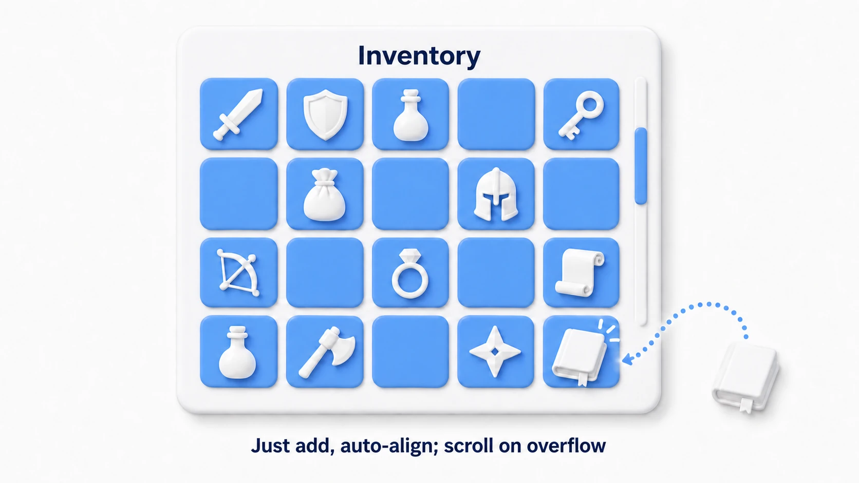
An RPG's inventory screen, a survival crafting materials list, a roguelite's picked-up items — the "arrange ever-growing items in a grid and scroll" inventory UI is the culmination of Layout Groups. Let's build it end to end combined with a ScrollView.
Building the UI (the no-code part):
- Create "UI > Scroll View" ("UI (Canvas) > Scroll View" in Unity 6.3 and later) and turn off the unwanted horizontal scroll (
Horizontaloff). - On the Content object inside the ScrollView, add a
Grid Layout Group— Cell Size 100×100, Spacing 10,Constraint: Fixed Column Count = 5. - Add a
Content Size Fitterto the same Content and setVertical Fit: Preferred Size— as items increase the Content stretches vertically, and the scroll range follows automatically. - Make one item-slot Prefab (an Image plus a child Image for the icon).
The script — it just creates slots and hangs them on the Content.
using System.Collections.Generic;
using UnityEngine;

public class InventoryUI : MonoBehaviour
{
    [SerializeField] private Transform content;        // The ScrollView's Content
    [SerializeField] private ItemSlot slotPrefab;      // The slot Prefab

    private readonly List<ItemSlot> slots = new List<ItemSlot>();

    // Call when an item is obtained
    public void AddItem(ItemData item)
    {
        // Just create it as a child of Content, and the Grid Layout Group places it
        ItemSlot slot = Instantiate(slotPrefab, content);
        slot.Setup(item);
        slots.Add(slot);
    }

    // Clear everything and rebuild (after a sort or filter, etc.)
    public void Refresh(List<ItemData> items)
    {
        foreach (ItemSlot slot in slots)
        {
            Destroy(slot.gameObject);
        }
        slots.Clear();

        foreach (ItemData item in items)
        {
            AddItem(item);
        }
    }
}
What I want you to notice is that there's not a single line of coordinate math. You make it a child with Instantiate(slotPrefab, content) — that's all you do, and "which cell it goes in," "which row it lands on," and "how far to stretch the scroll range" all become the Layout Group's job.
Two points matter most. "Split the work: arranging goes to the UI, data goes to the code" (the code side just manages a List of items; since display concerns aren't mixed in, sorting and filtering become plain List operations) and "remember the Content setup as the Grid Layout Group + Content Size Fitter set" (this two-piece set is reusable for ranking tables, stage select, gacha results — every scrolling list). To show item names in slots, combine with TextMeshPro; to use or equip on click, combine with buttons and event handling.
Bonus: Good Things to Know in Advance
- Layout recalculation isn't cheap: A Layout Group recalculates every time a child is added, removed, or resized. Avoid putting UI that moves every frame (like a stretching HP bar) under a Layout Group's control; use them for static lists and grids, where they fit best.
- They can nest: "Icons arranged horizontally within vertically stacked rows" is made by putting a Horizontal inside a Vertical's children. But deep nesting increases recalculation cost and unpredictability, so two levels is a practical guideline.
- Beyond a few hundred slots: Instantiating every slot gets heavy. The next step is "virtualized scrolling," which only creates what's visible and reuses it (a UI version of the object pooling idea).
- Designing the item-data side: Making the
ItemDatayou pass to slots a ScriptableObject cleanly separates data from UI. - There's also UI Toolkit: a system for building UI in a style close to HTML and CSS. When to use it over uGUI is covered in UI Toolkit Primer.
Summary
- Leave the arranging to a Layout Group rather than to code or hand-work — Horizontal for rows, Vertical for columns, Grid for grids.
- Margins are Padding (outer edge) and Spacing (gaps). A Grid's column count can be fixed with Constraint.
- A panel that grows with its contents is the Layout Group + Content Size Fitter (Preferred Size) set.
- Individual exceptions use a Layout Element (Preferred for sizing, Ignore Layout to exclude).
- Children being immovable by hand is by design — direct it via Hierarchy order and Layout Element.
- With a Grid + Content Size Fitter on a ScrollView's Content, you can build any scrolling list.
Your project's inventory — are you still placing slot coordinates by hand? Those 20 slots become "UI that's resilient to spec changes" in five minutes with a Layout Group.