Your UI looked perfect in the Game view. Then you run it on an actual device and the health bar is off-screen; you resize the window and buttons spill out of the menu—almost every classic UI headache comes down to a shaky grasp of anchors and the Canvas Scaler.
This article covers the three core concepts of Unity's UI system (uGUI)—Canvas, RectTransform, and Anchors—plus the go-to setup for handling different screen sizes.
What You'll Learn
- The Canvas and its three Render Modes (Overlay / Camera / World Space)
- RectTransform — how to read the UI-specific Transform
- Anchors — the main fix for "my layout broke when the screen size changed"
- Canvas Scaler — the standard resolution setup (
Scale With Screen Size)- An anchor cheat sheet by UI part (health bar, buttons, header, background)
Tested with: Unity 6 (6000.x)
Canvas: The Canvas Your UI Is Drawn On
Every UI element lives as a child of a special GameObject called a Canvas. The first time you create a UI element in a scene (Image, Button, and so on), Unity automatically generates a Canvas and an EventSystem (the mechanism that detects clicks and taps).
The Canvas's Render Mode decides where your UI gets drawn.
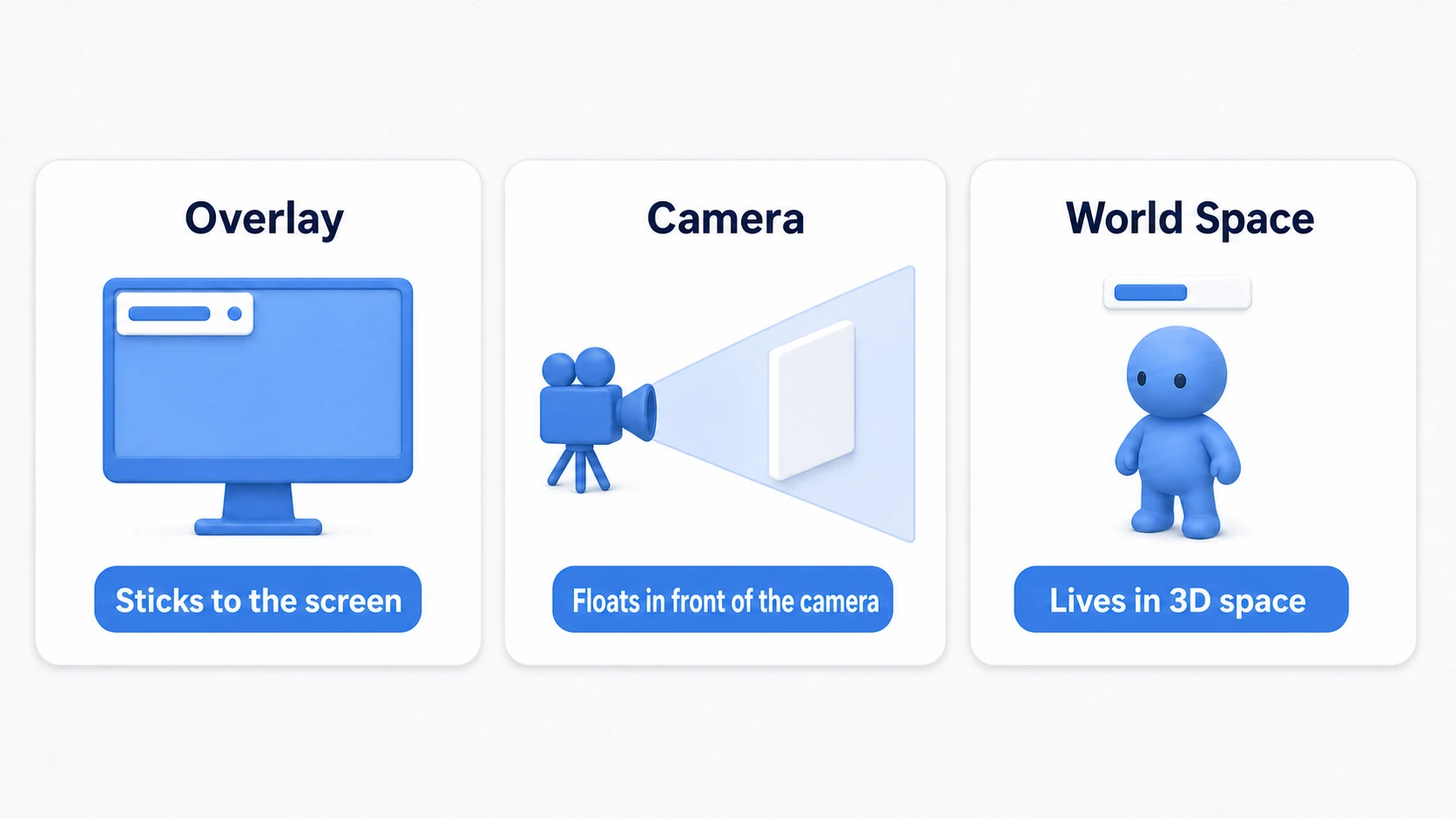
- Screen Space - Overlay: The most common. UI is drawn in front of everything, glued to the screen. Score displays, menus — regular UI is this.
- Screen Space - Camera: Drawn at a fixed distance in front of a specified camera. Use it when you need depth ordering with 3D, like particles appearing in front of the UI.
- World Space: Treats the UI as a panel inside the 3D world. For HP bars above characters' heads, VR menus — "UI that exists in the world."
Start with the default Screen Space - Overlay.
RectTransform: A Transform Built for UI
3D objects have their position, rotation, and scale managed by Transform, but UI elements use a dedicated version: RectTransform. The difference is that it works with a rectangle (a rectangular region) rather than a point.
- Width / Height: The UI element's width and height.
- Anchors: Where the element is pinned on its parent. The star player in preventing broken layouts (next section).
- Pivot: The element's own reference point — the center for rotation and scaling, usually the middle (0.5, 0.5).
Anchors: The "Anchor" That Keeps Layouts from Breaking
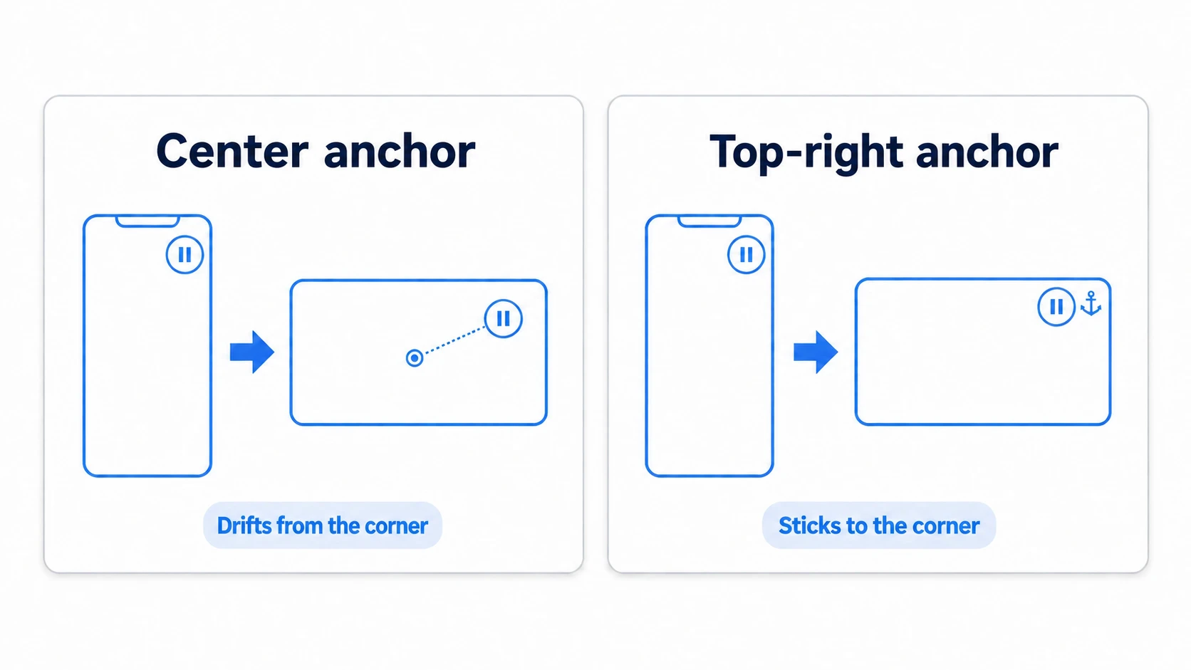
Anchors decide which relative position on the parent a UI element is "pinned" to. Phone aspect ratios vary by model. Put a button in the top-right corner while its anchor stays at the center, and on wider devices the button drifts away from the top-right corner toward the inside, while on narrower ones it spills off the screen.
Anchor Presets
Click the anchor icon in the Inspector (the crosshair-target-looking mark) to open the preset list.
- Pinning to corners or the center:
top-leftpins the element by its distance from the parent's top-left. UI that sits in a corner gets anchored to that corner — that's the rule. - Stretch: Choose a preset with separated corners, and the element stretches as the parent resizes. Header bars stretch horizontally, backgrounds stretch in all directions — those are the classics.
Understanding How Anchors Behave
What the Inspector numbers mean changes with the anchor state.
- Single anchor point:
Pos X/Y= the distance from the anchor point to the element's own Pivot. - Split anchors (stretch):
Left/Right/Top/Bottom= margins from the parent's edges.
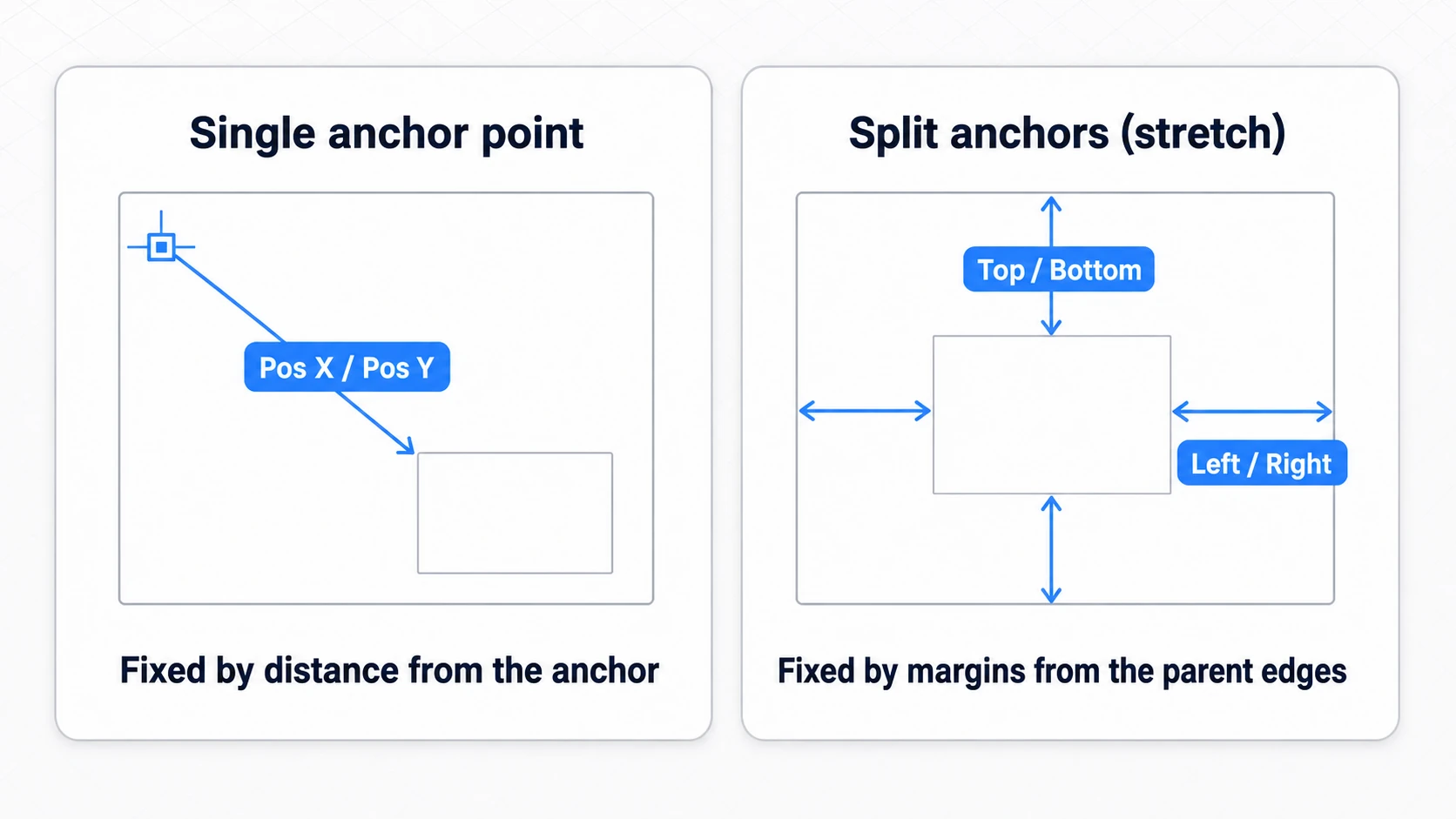
If you're ever confused because "the numbers changed meaning?", first check which preset the anchor is on.
Canvas Scaler: The Key to Resolution Independence
Anchors protect position, but size is protected by the Canvas Scaler. This component sits on the Canvas object's Inspector, and if you leave it on the default Constant Pixel Size, your UI shrinks to specks on high-resolution devices.
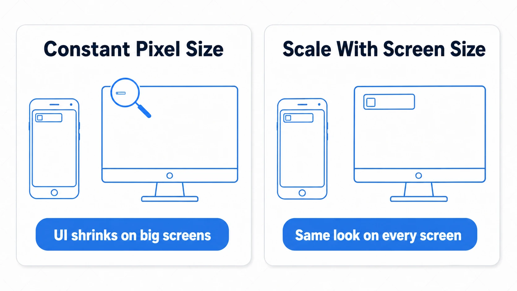
The standard setup is this three-piece set:
- Switch
UI Scale ModetoScale With Screen Size. - Enter your design's reference resolution (e.g. 1920×1080) in
Reference Resolution. - Set the
Matchslider to 0.5 (balance width and height), or lean towardHeight(1.0) for landscape games.
Now "UI designed at the reference resolution keeps the same visual proportions on any screen." Whenever you create a new Canvas, set up the Canvas Scaler first — make it a habit.
Hands-On: Building a Mobile HUD That Doesn't Break
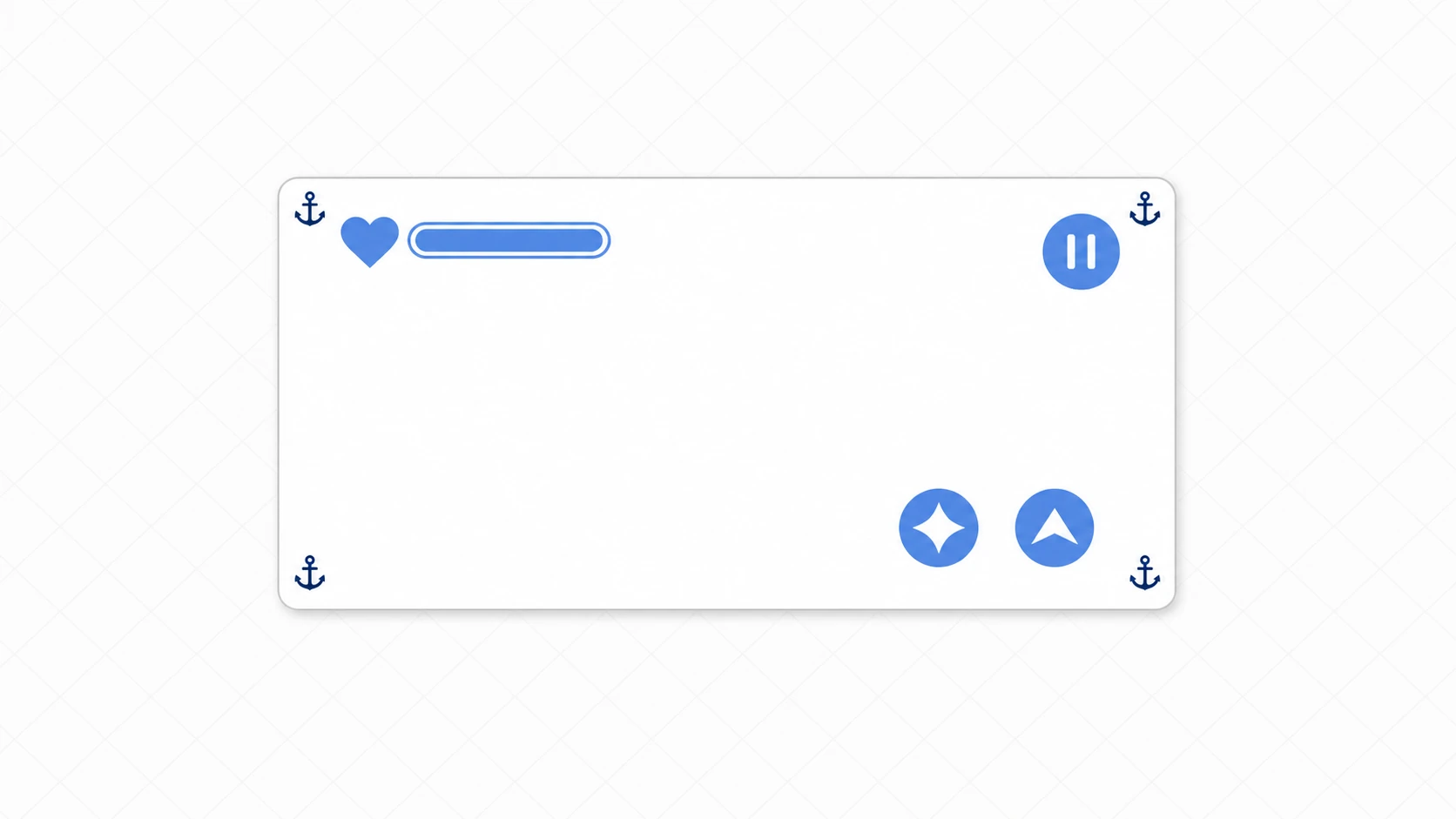
The health bar and pause button of an action game, the resource bar across the top of an idle game, the control buttons of a shooter — the genres differ, but mobile HUDs share a surprisingly common anatomy. Let's put the anchors and Canvas Scaler to work on a real HUD layout.
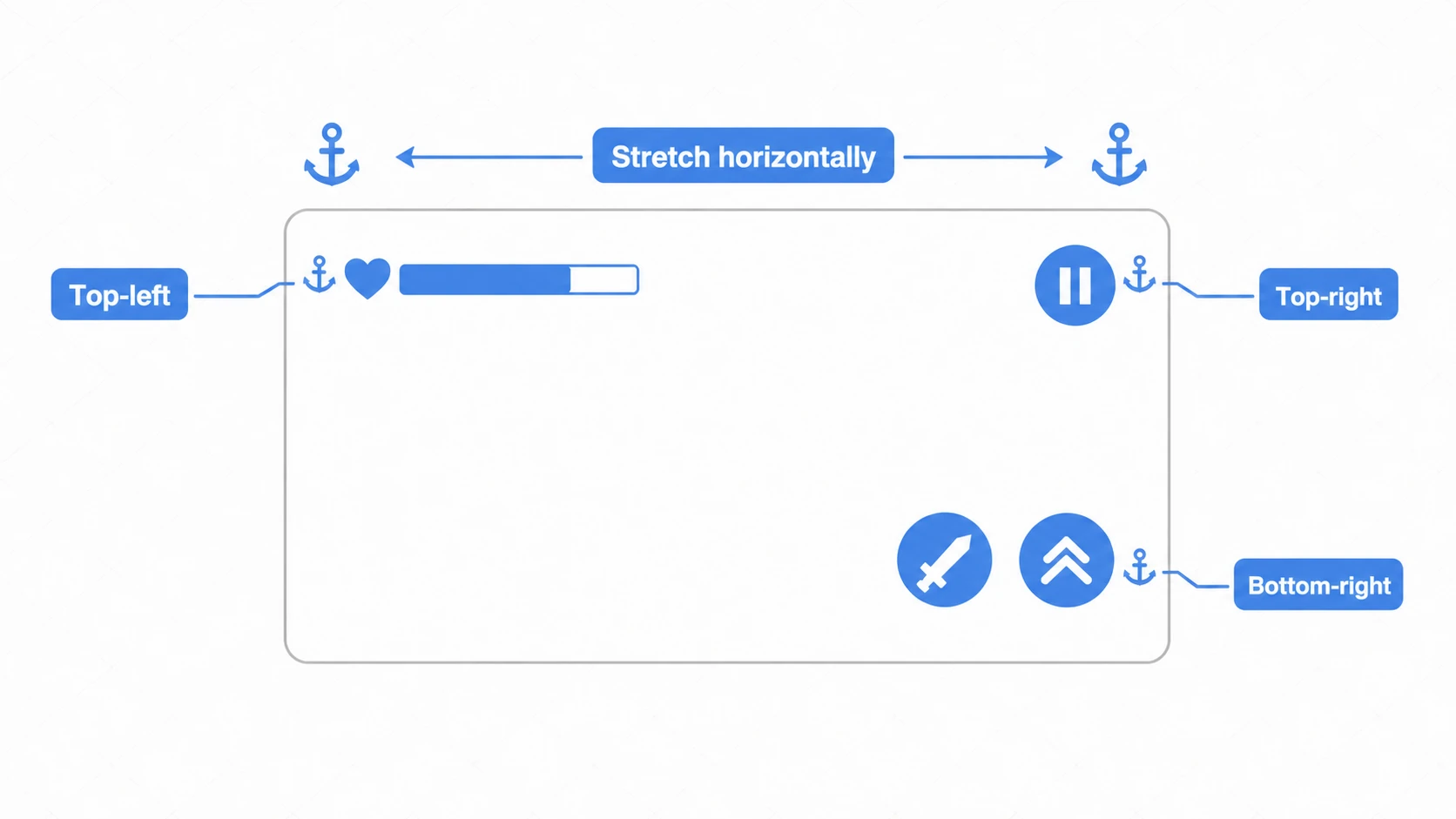
Three steps:
- Set up the Canvas Scaler on the Canvas:
Scale With Screen Size+ reference resolution (e.g. 1920×1080) +Match 0.5. Lock in the size baseline first. - Place each part, then set its anchor: After roughing in the position, pick the anchor preset with Alt+Shift+Click — it snaps anchor, position, and pivot to that corner all at once. Very handy.
- Assign anchors from the cheat sheet: When in doubt, use the table below.
| UI Part | Anchor | Why |
|---|---|---|
| Health bar / score | Top-left (top-left) | Stays pinned top-left at any aspect ratio |
| Pause button | Top-right (top-right) | Same (pinned top-right) |
| Confirm / jump buttons | Bottom-right (bottom-right) | Pinned within thumb reach on phones |
| Header bar | Top, horizontal stretch | Stretches to follow the width |
| Background panel | Stretch in all directions | Always covers the whole screen |
| Center dialog | Center (middle-center) | Always mid-screen |
Two points matter most.
- "Corners go in corners, stretchy things stretch": Anchor position-critical parts to their corner; let parts that should follow the width or fill the screen stretch. Reduce every HUD to this binary and you'll never hesitate.
- After placing, sweep the aspect ratios: Use the aspect ratio dropdown at the top of the Game view (
Free Aspectby default) to hop between 16:9, 4:3, and 21:9 (add ratios that aren't listed with the+at the bottom) and catch overflow and overlap on the spot. A hundred times cheaper than discovering it on a device.
For the health bar's fill (draining the gauge as HP drops), the standard approach is to set the Image component's Image Type to Filled and use Fill Amount (the Image Type field appears once you assign an image to Source Image). If you're pairing it with text, the TextMeshPro guide is your next step.
Bonus: Good Things to Know in Advance
- Use TextMeshPro for text: The current standard for uGUI text is TextMeshPro, not the legacy Text component (see the TextMeshPro guide).
- Use Layout Groups for anything in rows: Inventory item lists and button rows should be auto-arranged with
Horizontal/Vertical/Grid Layout Groupinstead of manual placement, so they adapt as items come and go. The Layout Group guide covers when to use which, through to a hands-on build. - Don't delete the EventSystem: When buttons stop responding, first check that the scene still has an
EventSystem— it's what detects UI clicks and taps. The mechanics of buttons and their common pitfalls are covered in the button and click events guide. - Notch handling (Safe Area): Avoiding phone notches and home bars requires Safe Area support via
Screen.safeArea. For mobile UI, keep it on your radar early — it saves pain later. The implementation is in Your First Mobile Port. - Another UI system: Unity also has UI Toolkit besides uGUI. For the differences and when to use which, see Getting Started with UI Toolkit
Summary
- The Canvas is the foundation. Render Mode is usually
Overlay; overhead HP bars useWorld Space. - RectTransform is the UI-specific Transform that works with rectangles. What its numbers mean depends on the anchor state.
- Anchors protect position. "UI in a corner gets anchored to that corner" is the rule; stretch what should stretch.
- The Canvas Scaler protects size.
Scale With Screen Size+ a reference resolution is the standard. - Start from the cheat sheet, then verify by switching aspect ratios in the Game view.
Master anchors and the Canvas Scaler, and you've prevented 90% of "it broke on the device." Rule your anchors and you rule uGUI.